


Widgets are custom built components that are used to display various content throughout the site. Widgets are added to "Sections" when editing on the "Page" tab by clicking on the blue + button within the section. There are two ways widgets display content. They either reference a path to a page type, or are directly editable within the widget dialog. Editing widgets is always done by clicking on the cog wheel on the right hand side of the widget.
| Widget Name | Description |
|---|---|
| Accordion | this widget will add an FAQs accordion to a page by referencing the "Accordion Tab" page type folder location |
| Alert Box | this widget is to be added to show an alert. We may change this widget functionality and make it a setting in the settings app 2/2/23 |
| Anchor Links | This widget when placed on the page will create an anchor link that will display on the "Anchor Menu". The ID needs to alpha numeric and be unique |
| Anchor Menu | This widget will display an anchor menu and will display the "Anchor Links" of the page |
| Banner Image With Caption | This is what is used on the Homepage and several pages throughout the site. |
| Centered Header with Text | This is used for headers on pages with colour underlines and sub header text |
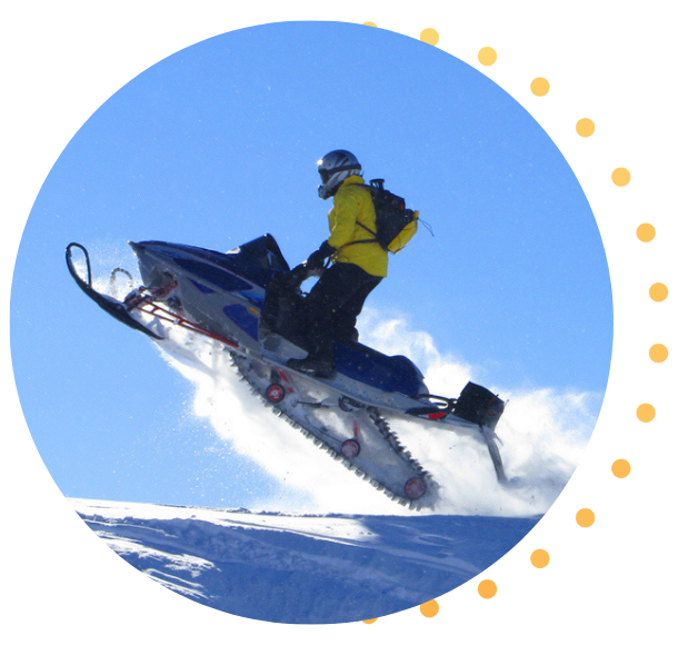
| Circular Image Banner | This is the widget used to add a half circle background image to page headers. It includes a title, description, image, and button link |
| CTA Banner | This is a widget that allows you to add a coloured banner with text, description, button/link |
| Homepage Hero | This is a widget that connects to the image slide page type. This is similar to the "Banner Image with Caption" widget except it turns into a slider when more page types are added. |
| Image Text CTA with Alternating Left / Right Image | This is a 2 column text and image widget. Editable within widget properties |
| Insurance Products Grid | This will connect to the "Insurance Product Card" page types |
| Insurance Products Inline Grid | This will display a smaller version of the Insurance Product Cards |
| Key Stats Display | This will connect to the "Key Stats" page type |
| Key Values Display | This will connect to the "Key Values" page type |
| News Slider | This will display "News" page types in a carousel slider |
| Rich Text | This is an HTML web editor used to add content: text, images, links |
| Spacer | This is a widget that allows you to add space between any widget |
| Testimonial Slider | This widget connects to the "Testimonial" page types and displays them in a slider |
| Two Column 2 row - image / text | This widget is used throughout the site to add 2 columns and 2 rows of image and text, links to a page |

Description text here. Usually used at the top of pages or to as a separating title

The image width is 625px. For best results match the image height to the height of the text in this box.
Additional options include the ability to include a button and link as well as a switcher that allows you to alternate the image and text columns.
This is useful when you have multiple widgets on the page or are using this with the two column two row widget
Some copy here
Some more copy here
Our recreation and leisure insurance experts will provide you with unparalleled coverage and service.
We put our clients first in everything we do. That’s why more than 92% are repeat customers.
Orbit is a new name for a group of companies that have been around since 1964. Since 2020, a number of brokerages have joined Orbit, bringing their decades of experience to our customers.
Our relationship with our clients is what sets us apart. We put our clients first in everything we do and offer specialized insurance expertise. That’s why more than 92% of our clients are repeat customers.
Respecting your privacy and protecting your personal information is an important part of how we do business. We value the trust you have in us and we are committed to protecting your privacy.
We value the trust you have in us and we are committed to protecting your privacy.
We put our clients first in everything we do. That’s why more than 92% are repeat customers.
Our expert insurance brokers will provide you with unparalleled coverage and service.
We value the trust you have in us and we are committed to protecting your privacy.
With more than 50 years helping riders, we can help you find the right coverage for your bike.
We put our clients first in everything we do. That’s why more than 92% are repeat customers.
We value the trust you have in us and we are committed to protecting your privacy.
body text (font size 14px)
Link should be formatted using bold, not underlined.

I would like to thank you for help with our claim. You were one of the people who helped us make it this far. The cottage will be wonderful, and the final adjuster has been very good. Not easy, but fair and compassionate.

I would like to thank you for help with our claim. You were one of the people who helped us make it this far. The cottage will be wonderful, and the final adjuster has been very good. Not easy, but fair and compassionate.

I called about ten places. You really do have to compare. And bundling makes a huge difference. Just changing my home insurance basically paid for my motorcycle insurance.
I called about ten places. You really do have to compare. And bundling makes a huge difference. Just changing my home insurance basically paid for my motorcycle insurance.
After being with the same company forever, my wife and I switched all our insurance to Orbit. We have a total annual savings of $2473! Thank you.
After being with the same company forever, my wife and I switched all our insurance to Orbit. We have a total annual savings of $2473! Thank you.
Great experience! I was worried as it was my first time getting insurance for our Camper. Was quick, easy and friendly. Very responsive and made sure I understood everything.
I just got off the phone with my broker. I ended up saving $300 dollars on my motorcycle insurance. Call them, you can’t lose
I called this afternoon to pay for my auto insurance renewal. What a pleasure! I was lucky enough to speak with France, who explained to me the 5% discount with the combination of auto/home insurance. What a gem! You must be proud to have them on your team.
I have been dealing with Sal for quite some time now. She is an amazing broker. She is always so friendly and easy to deal with, I never have to worry about the right coverage; she always makes sure I’m aware of all coverages available. I hope you don’t mind, I always ask for her when I call.
My insurance renewal went up 300 bucks with my old provider. I switched to Orbit and I’m paying less for auto and home insurance than I was.
My insurance renewal went up 300 bucks with my old provider. I switched to Orbit and I’m paying less for auto and home insurance than I was.
When your insurance is up for renewal, consider giving Orbit Insurance Services a call. We were able to save almost $700 by switching. A few folks from our riding circle have called as well, and everyone was able to secure a lower rate
After being with the same company forever, my wife and I switched all our insurance to Orbit. We have a total annual savings of $2473! Thank you
I called about ten places. You really do have to compare. And bundling makes a huge difference. Just changing my home insurance basically paid for my motorcycle insurance.
Enter some text for this section.
Enter some text for this section.
-Home.svg?ext=.svg)
-Auto.svg?ext=.svg)
-Travel.svg?ext=.svg)


-Home.svg?ext=.svg)
-Auto.svg?ext=.svg)
-Boat.svg?ext=.svg)
-Business.svg?ext=.svg)
-Collector.svg?ext=.svg)
-Prize-Indemnity.svg?ext=.svg)
-Motorcycle.svg?ext=.svg)
-RV-Class-A.svg?ext=.svg)
-RV.svg?ext=.svg)
-Travel.svg?ext=.svg)